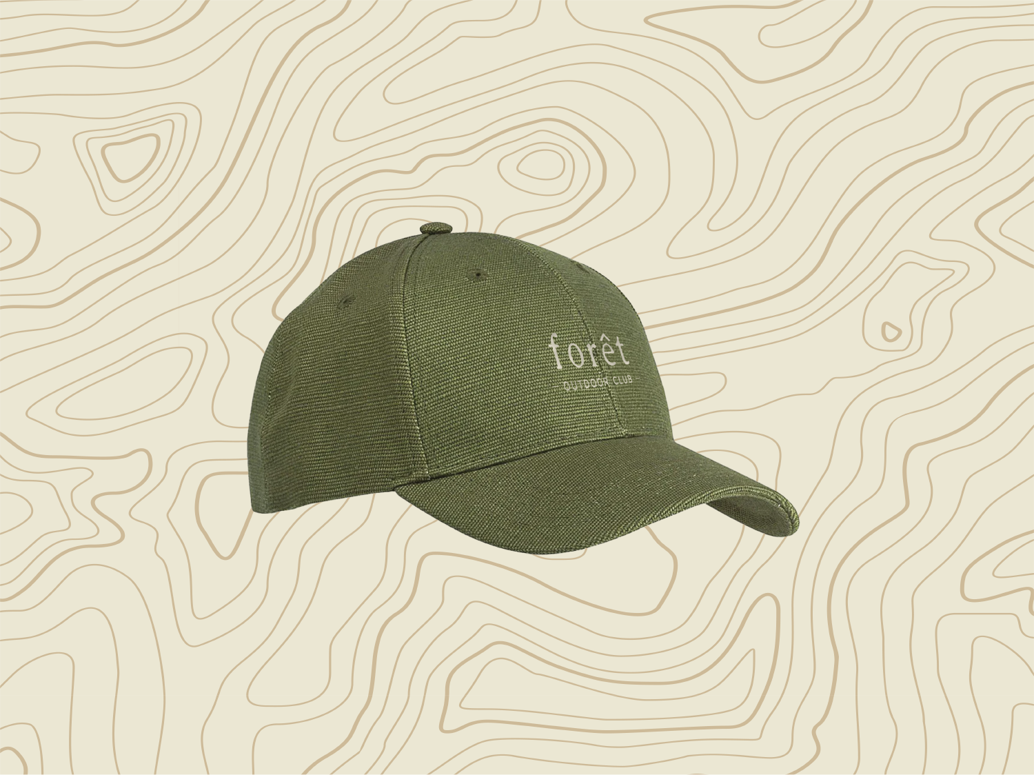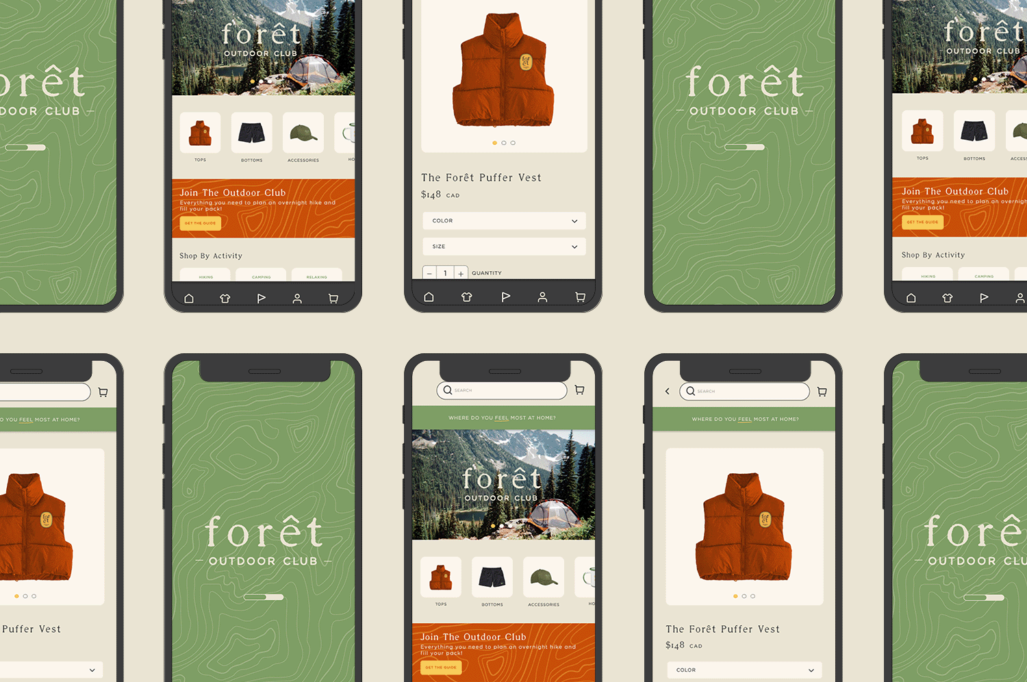
forêt outdoor club
Naming | Logo | Brand Identity | Icons | App Design
The creation of forêt outdoor club sparked from a design challenge to myself. What would it look like if I was a brand? Playing both the roles of the client and the designer, I embarked on the challenge.
As the client, I wanted something that felt inviting and grounded. A brand that would postively impact the earth, encourage people to spend time outside in nature, and connect with themselves.
I settled on creating a brand for women that would include outdoor gear like clothing, accessories, and basic camp essentials that were well-constructed for the outdoor terrain but also aesthetically pleasing and of course, kind to the earth. The brand would also extend beyond products and function as a "club", offering outdoor events like hiking, camping, and kayaking, as a way to connect with other women or oneself while spending time in nature.
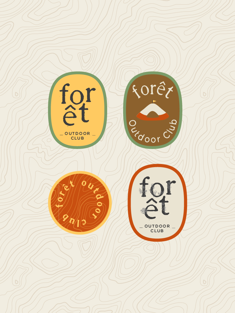
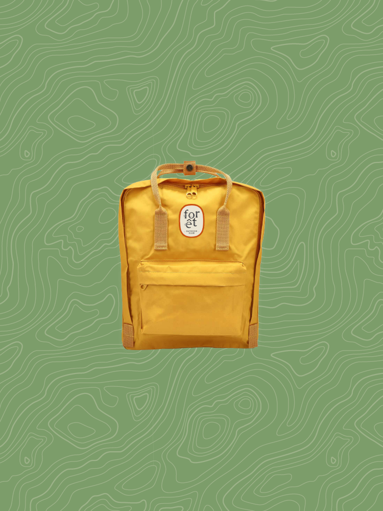
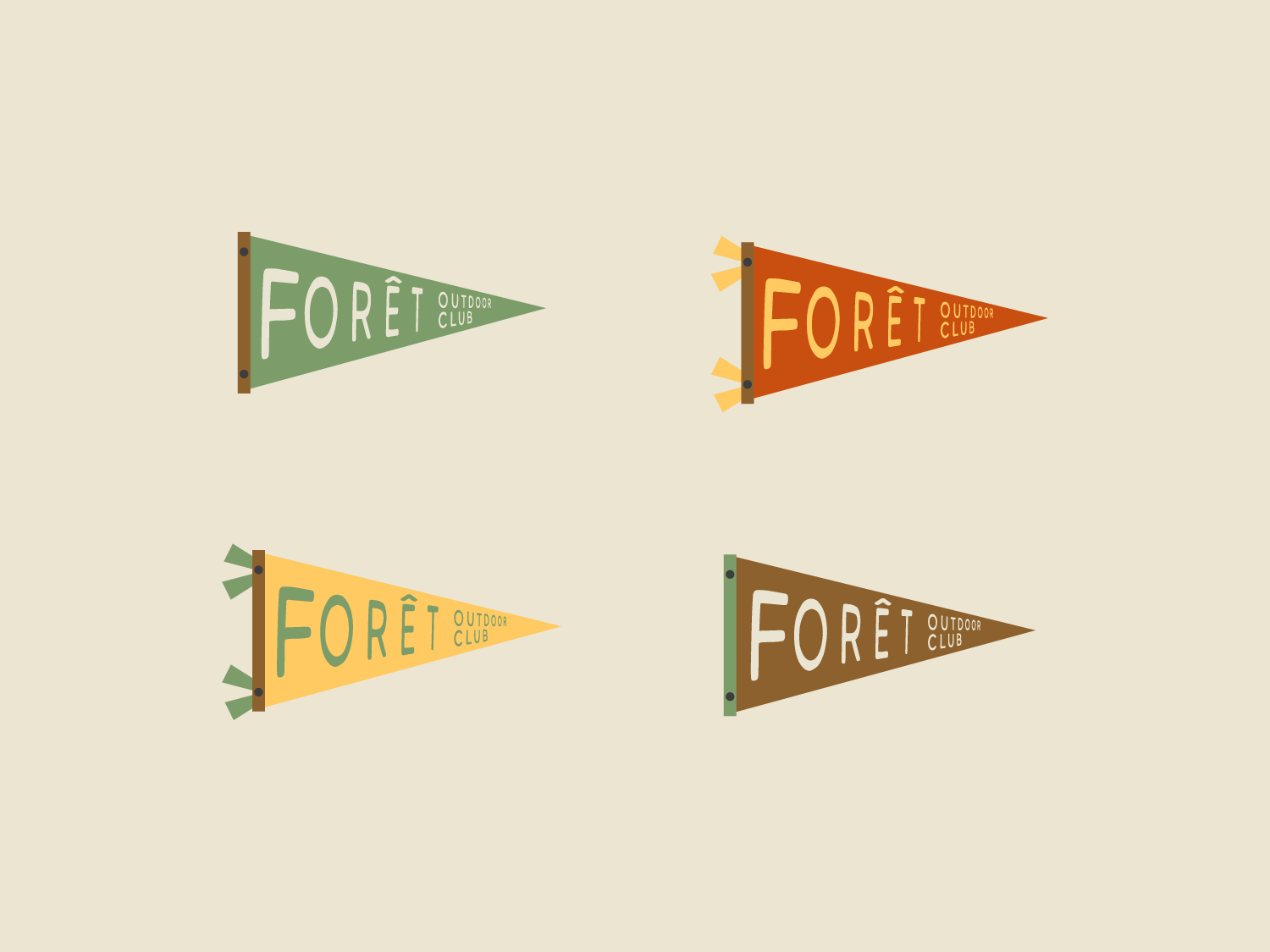
As the designer, I found inspiration in a vintage camp flag, like the ones you would see at summer camp. I let this symbol, a nostalgic reminder of feeling free yet also part of a community, inspire the brand's colors, secondary logos and icons. I paired hand-drawn illustrations with icons I designed to create emblems and patches for the clothing and accessories.
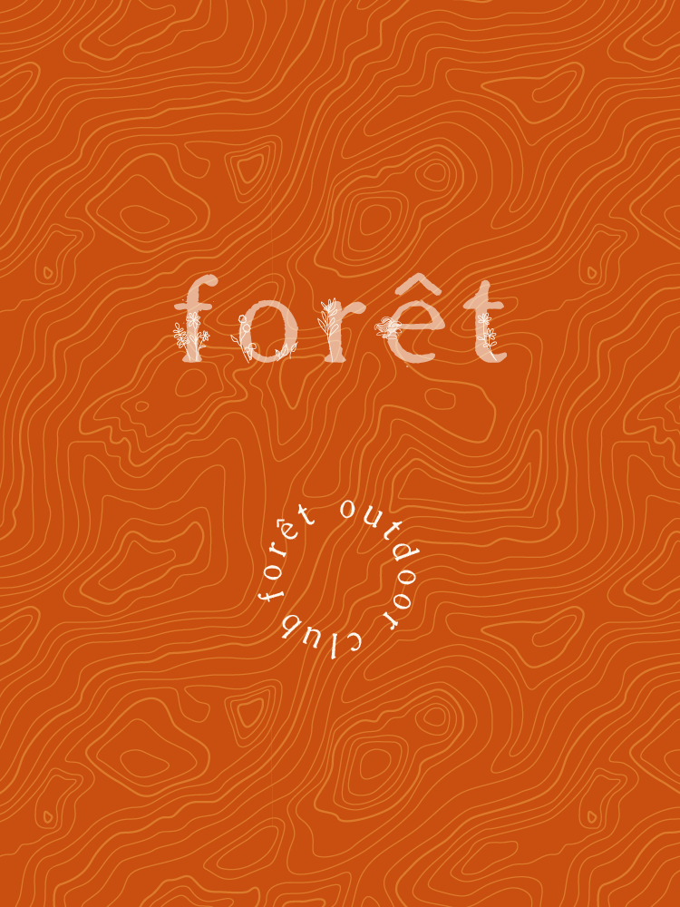
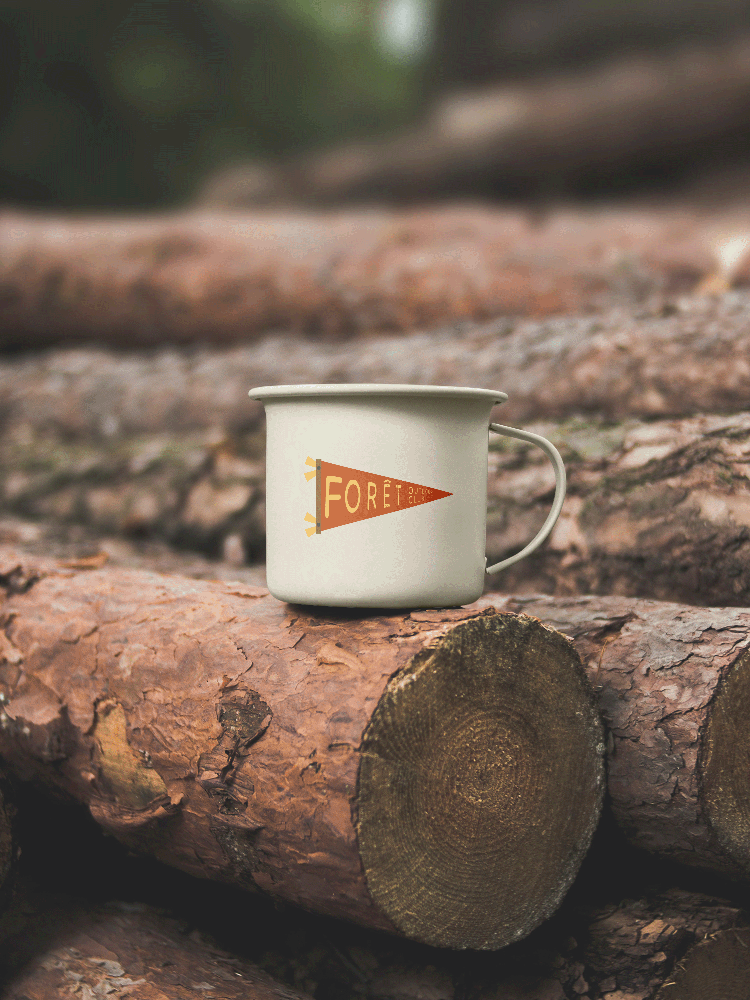
The name is a reflection of everything the brand represents: the outdoors, connection to both oneself and others, and quality but with an added softness. Something that is often missing from other outdoor brands.
